
Here’s how it may have gone down: You came to a stoplight. Your eyes wandered until they landed on the vehicle ahead of you. Because most SUVs and cars look the same today, you looked mindlessly at it until the logo caught your eye. Then you got to your destination and hit up your search engine with “What is a KN car?” or a variation on the theme.
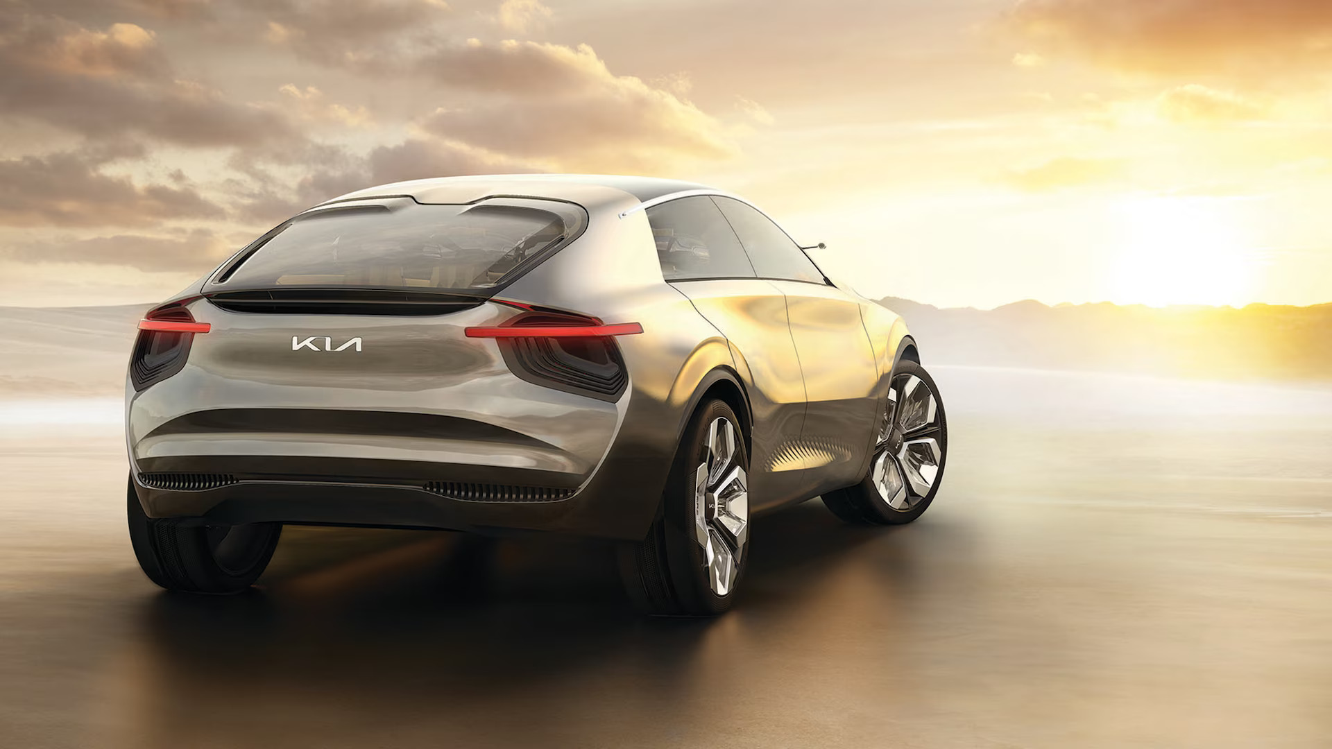
“KN is Kia? Wow, that logo is a terrible design,” you might have thought. Or maybe you came to a different conclusion: “What a forward-thinking logo!” Either way, you could call it a marketing success for Kia because the logo went viral and started a rowdy debate online. Is this the first time Kia pushed the design envelope with its branding? Here’s a look back at almost 70 years of Kia logos so you can decide for yourself.
1953 to 1964: Kia’s First Logo
1964 to 1986: Kia’s “Q” Logo

1986 to 1993: Entering the United States
1994 to 2004: The Familiar Logo Begins
2004 to 2012: Minor Design Tweak
2013 to 2021: Dawn of Change
2021 to Present: An Electric Focus
Author: Tori Tellem
Source: MotorTrend.com


 Ru
Ru Az
Az